Tips for Better Results
Getting good covers isn't about luck — it's about giving the AI the right inputs and iterating deliberately. These tips cover what actually moves the needle, from how you describe your book to when to switch tiers.
1. Be specific in your description
Vague descriptions produce generic covers. The more precisely you describe the scene, atmosphere, and details you want, the more the AI has to work with.
Instead of: "Thriller book cover"
Try: "Dark psychological thriller set in a crumbling Victorian mansion at dusk, with fog rolling through dead gardens and a single lit window casting amber light"
Include setting, atmosphere, time of day, and any key visual elements that matter for the genre. Think of it less like a search query and more like art direction.


2. Use all your attributes
Genre alone doesn't steer the AI very far. Every attribute you fill in adds another dimension of control over the output.
A Thriller with Moody mood and a Dark palette produces a very different cover than a Thriller with Intense mood and a High Contrast palette — even with the same description.
Fill in:
- Mood — the emotional register of the cover
- Art Style — illustration approach (painterly, photorealistic, graphic novel, etc.)
- Visual Elements — specific objects, motifs, or scene details to include
- Color Palette — the dominant color story
The combination of all five attributes gives the AI a much richer brief to work from.


3. Start quick, then go detailed
Quick tier (3 credits per image) is fast and cheap. Use it to explore directions before committing.
A practical workflow:
- Generate 4–8 Quick images with different attribute combinations.
- Find the combination that's closest to what you want.
- Switch to Detailed (5 credits per image) for the final, export-ready version.
Quick images cannot be exported to KDP — they're intentionally low-resolution for prototyping. Once you've found a direction you like, Detailed gives you the full 1600×2560 at 300 DPI that Amazon requires.
See Understanding Credits for a full breakdown of tier costs and plan requirements.
4. Let AI Fill do the heavy lifting
If you're staring at five attribute fields and not sure where to start, use AI Fill. Click it in the left sidebar, describe your book in plain language, and it suggests a complete attribute combination.
AI Fill costs 1 credit and often surfaces combinations you wouldn't have thought of — especially useful when you know the feel of your book but aren't sure how to translate it into specific attribute values.
After it suggests attributes, you can review, edit, and tweak each one before applying. You're never locked into what it proposes.


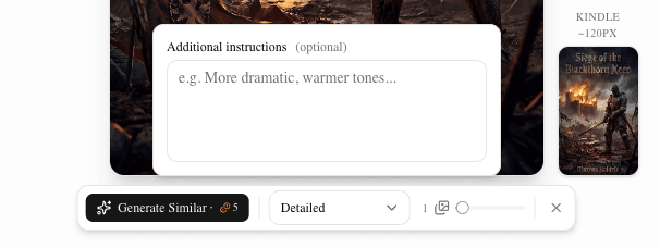
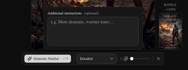
5. Use "Generate Similar" to iterate
Found a cover that's 80% there? Don't start over from scratch.
Click Generate Similar on any generation in the History tab to create new variations using the same attribute set. The AI keeps the same creative direction while exploring different compositions, lighting, and details.
This is the fastest way to narrow in — you're not changing the brief, you're exploring the space within it.
See The Cover Editor for a full walkthrough of the History tab and generation controls.
6. Extend instead of restarting
If you like the direction of a generation but want more options, use Generate More to add images to the existing generation. New images use the same attributes and brief as the original batch.
This is cheaper in practice than starting a new generation because you're already confident in the attribute combination — you're just asking for more variations, not re-exploring from scratch.
New images appear appended to the same generation group in History, so everything stays organized.
7. Bake for professional text integration
For most genres — especially thriller, fantasy, and romance — styled text that looks like it belongs in the image separates amateur covers from professional ones.
How to use Bake Layers:
- Add your title and author name as text layers on the canvas.
- Click Bake Layers in the editor toolbar.
- Choose a bake style:
- Stylized — AI applies genre-appropriate effects (metal embossing, neon glow, aged stone). Text feels integral to the scene.
- Clean — Natural blending without heavy effects. Better when readability is the priority.
- Generate. The result has the text woven into the artwork, not floating on top of it.
After a successful bake, visible text layers are cleared automatically — the text is now part of the image and doesn't need to be rendered twice.
See The Cover Editor for the full bake walkthrough.


8. Experiment with color palettes
Color has an outsized effect on genre signaling and emotional tone. The same description with different palettes can produce dramatically different covers.
Some starting points by genre:
- Romance — warm golds, soft pinks, deep burgundy
- Thriller — cold blues, stark blacks, high contrast
- Fantasy — jewel tones (emerald, sapphire, deep violet)
- Literary fiction — muted, desaturated, earthy
- Sci-Fi — electric blues, cyan, dark with bright accents
Don't treat palette as an afterthought. Try the same description with two or three different palettes before deciding on a direction — the results often surprise you.
9. Don't settle on generation one
The magic of AI cover design is in iteration. Your first generation is a starting point, not a finished cover.
Expect a rhythm of: generate → evaluate → adjust one or two attributes → regenerate → compare with the previous batch. Each round gets closer to what you're looking for. The covers that look effortlessly right usually came from five or six rounds of refinement.
Use the amber diff indicators in the History tab to track exactly what changed between generations — so you can see what each adjustment did and back it out if it moved in the wrong direction.
Further reading
- The Cover Editor — canvas, layers, text, bake, and export
- Understanding Credits — tier costs, plans, and refunds
- AI Book Cover Design: What Works — deeper strategy for getting the most from AI generation